Description
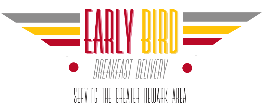
Described in ideation as “racy” and “retro”, the brand was to communicate the level of quality being used along with how fast customers could expect to be served hot food at their door step, with a bird somewhere in the picture. The typography selection features sharp elongated lettering with an 80’s retro feel that you would find in “Grace Land”, next to the name brand are sharp edged lines in the shape of wings, along with little illustrated birdies. The color theme selection resembles classic chicken coops, red yellow and white.
Role
Designer
Technology
Photoshop , Illustrator
Client
Early Birds
Year
2018
Launch


